From Jackrabbit's inception until late 2015, the Online Class Listings JavaScript code and URLs (links) used were "traditional" code/links that displayed with table borders and weren't mobile-friendly (meaning they didn't display well on mobile devices).
In 2015, Jackrabbit developed new responsive code that automatically transforms into vertical display on small screens (the website must be optimized for mobile viewing).
The code and links in this Help Center are the updated responsive code/links. If you use these code/links and your site is mobile-optimized, the Online Class Listings will work correctly on cell phones, iPads, etc.
Responsive Code/Link Compared to Traditional Code/Link
When viewed on a large screen, the difference is simply the borders and shading. However, the traditional Online Class Listings tables do not work well when viewed on smaller screens.
The responsive code/links produce a listings table that automatically adjusts to a mobile-friendly view when viewed on a mobile-friendly web page.
Example - tables viewed on a large screen
Traditional table - cells have borders
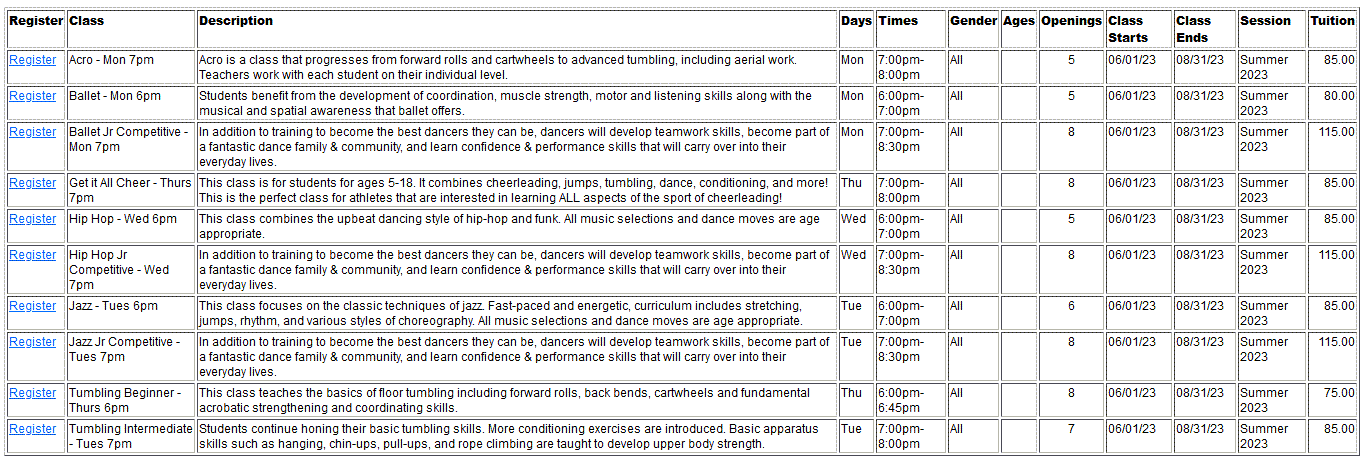
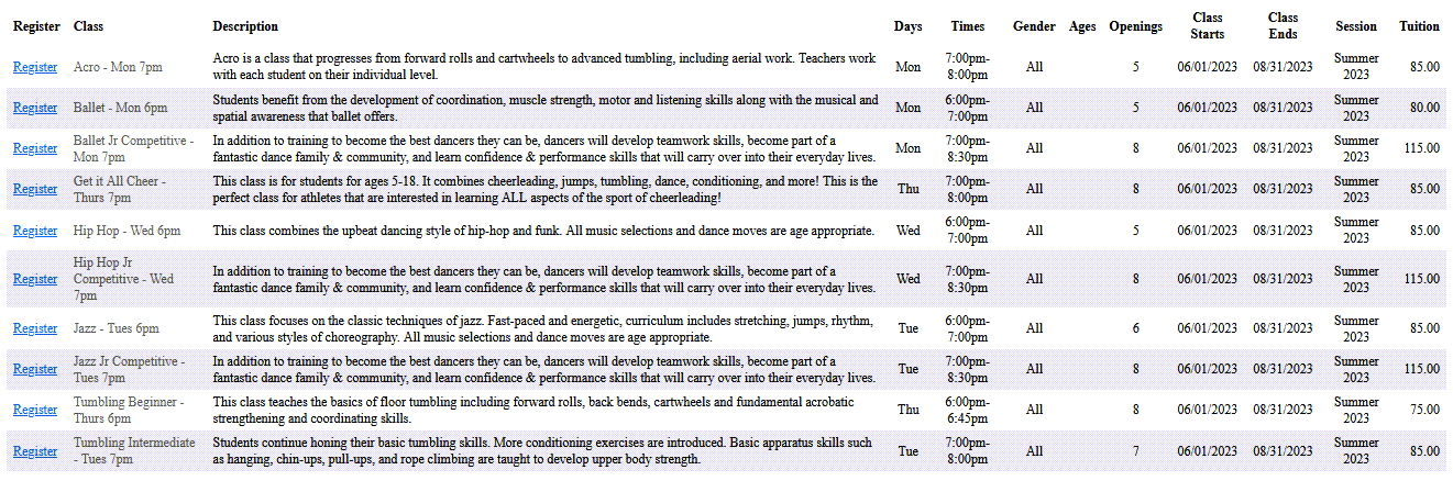
Responsive table - no borders, rows alternate shading
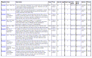
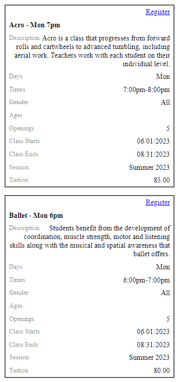
Example - tables viewed on a small screen
Traditional table - all cells are displayed on the screen
Responsive table - automatically converted to blocks
Change Traditional Table Code/Link to Responsive Table Code/Link
To convert traditional Jackrabbit Online Class Listings tables to the responsive version, you will need to log into your website editor and edit each code/link that is producing a table, i.e. if you have 8 separate tables, you will need to edit the code/link for each of those 8 tables.
Most of the HTML string stays the same; only the 'path' is different. The path (highlighted in yellow) is the only part of the HTML string you will need to edit.
Replace the JavaScript for Your Tables
If you currently script the tables into your own web page, you will need to change the HTML string. Replace Openings.asp?id with the responsive table code path jr3.0/Openings/OpeningsJS?OrgID.
Note: this code is for the basic listings table. If you have customized your Online Class Listings, you'll add that HTML string after your OrgID. The XXXXXX represents your Organization ID.
| Traditional Table Code |
|
<script type="text/javascript" src="https://app.jackrabbitclass.com/Openings.asp?id=XXXXXX"></script> |
| Responsive Table Code |
|
<script type="text/javascript" src="https://app.jackrabbitclass.com/jr3.0/Openings/OpeningsJS?OrgID=XXXXXX"></script> |
Replace the Link for Your Tables
If you currently link to an Online Class Listings table, make the following change to the link. Replace the URL path OpeningsDirect.asp?id with this new path jr3.0/Openings/OpeningsDirect?OrgID.
Note: this URL (link) is for the basic listings table. If you have customized your Online Class Listings, you'll add that HTML string after your OrgID. The XXXXXX represents your Organization ID.
| URL(link) for Traditional Table |
|
https://app.jackrabbitclass.com/OpeningsDirect.asp?id=XXXXXX |
| URL (link) for Responsive Table |
|
https://app.jackrabbitclass.com/jr3.0/Openings/OpeningsDirect?OrgID=XXXXXX |
Adjust Table Font Sizes
The font size is 9 pt. in both the traditional tables and responsive tables; however, the responsive tables may not respond to your CSS rules dictating a different font size. If you need to dictate a different font size for the larger version of the responsive tables, your website administrator should use something like this in the CSS:
@media (min-width: 62em) {
.jr-container .responsive-table {
font-size: 12px;
}
}
Need a hand? We have a team of Integration Specialists ready to help!